Project Context
Role: UX/UI Design Team Lead (UX research, wireframing, prototyping, final UI design)
Mission: Decrease cart abandonment rate
Timeline: August - December 2022
Client: Amphy product team
Programs used: Adobe XD, Adobe Creative Suite
Being the sole designer on this project, I played a pivotal role in every stage of its development. From conceptualizing the flows and crafting wireframes to bringing the final prototype and UI design to life, I was deeply involved throughout. Collaborating closely with all pertinent stakeholders, I ensured a cohesive and comprehensive approach that translated the project's vision into a tangible and user-centric reality.
With the guidance of the CEO, General Manager, Project Manager, and Development team, the project took 2-3 months to design and 2 more to implement.
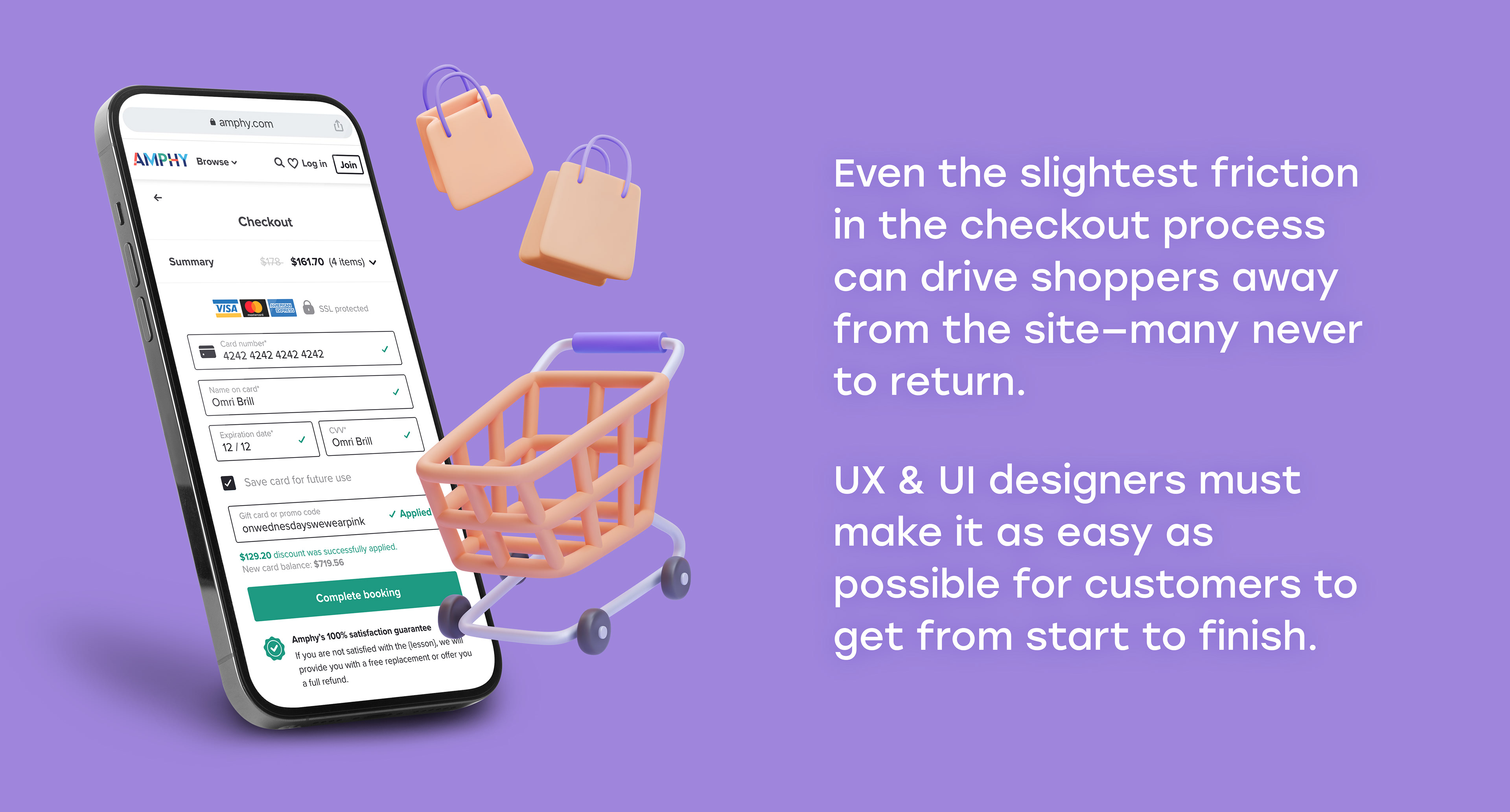
The checkout process can make or break the shopping experience. By default, checkout demands more cognitive load than any other step in a customer journey: filling out forms, thoroughly checking the data, and making a final purchasing decision. If we put too little attention to the checkout UX/UI, the situation exacerbates. Many customers end up leaving a store, raising the cart and checkout abandonment rate.
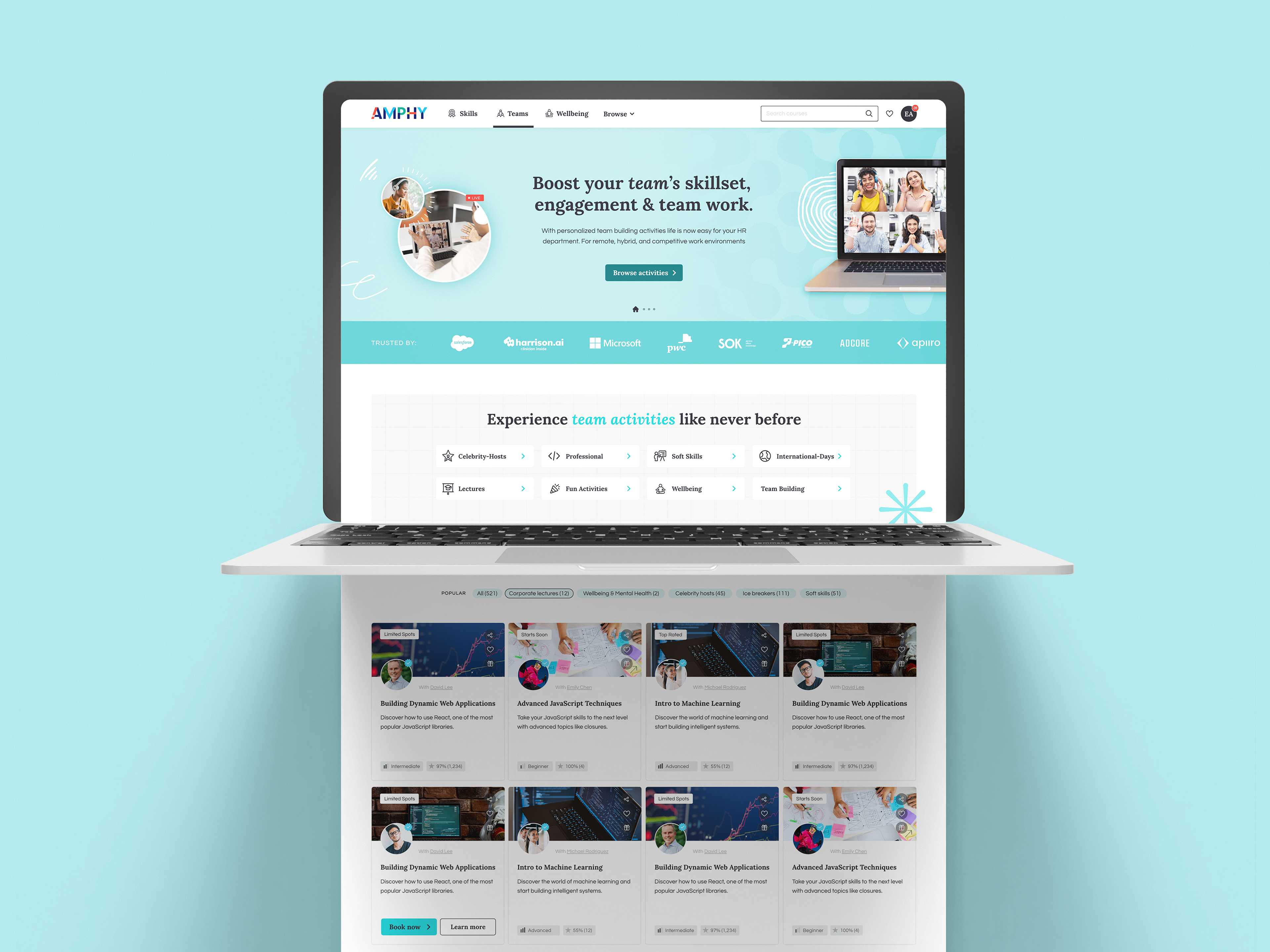
Amphy.com is an online platform, that offers live & interactive online courses, experiences, and events in over 100 categories. In this project, my main focus was on making the checkout process easy, intuitive, and most importantly short, by improving credibility and clarity.
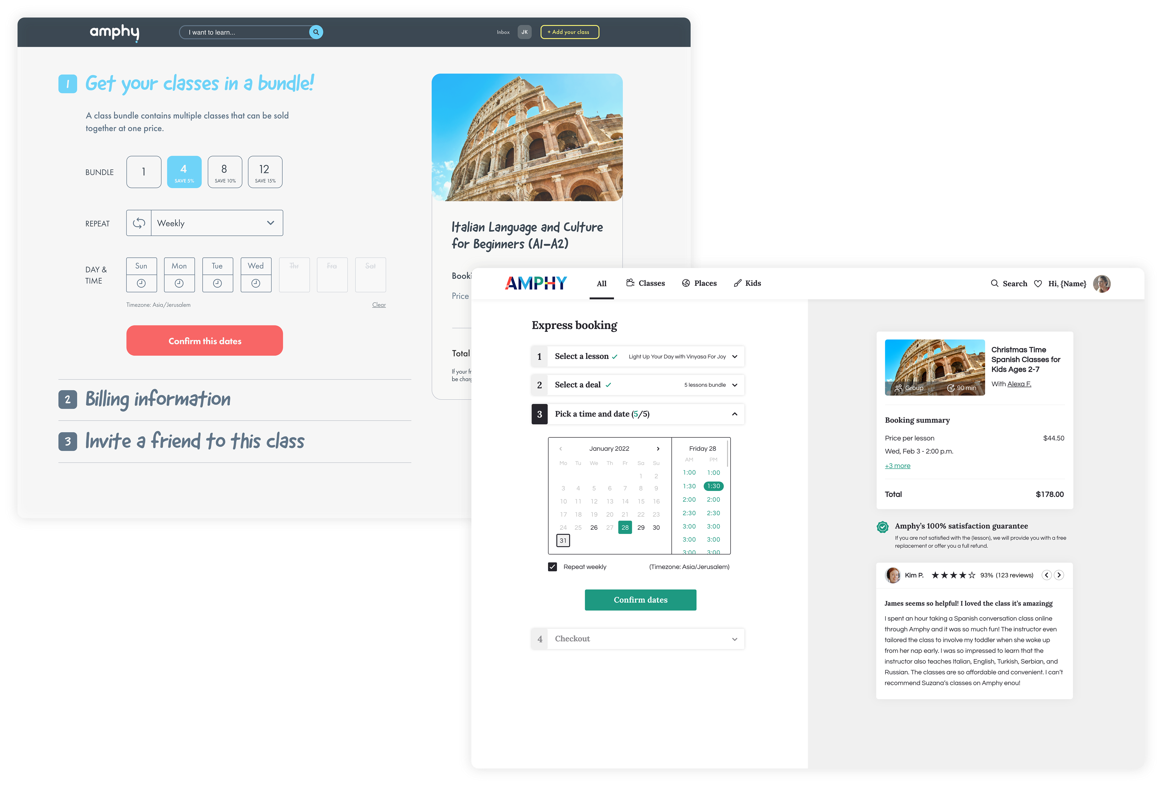
By folding all the steps into an accordion, we're promising clarity and transparency, showing all the process in a form of a 'summary' view.
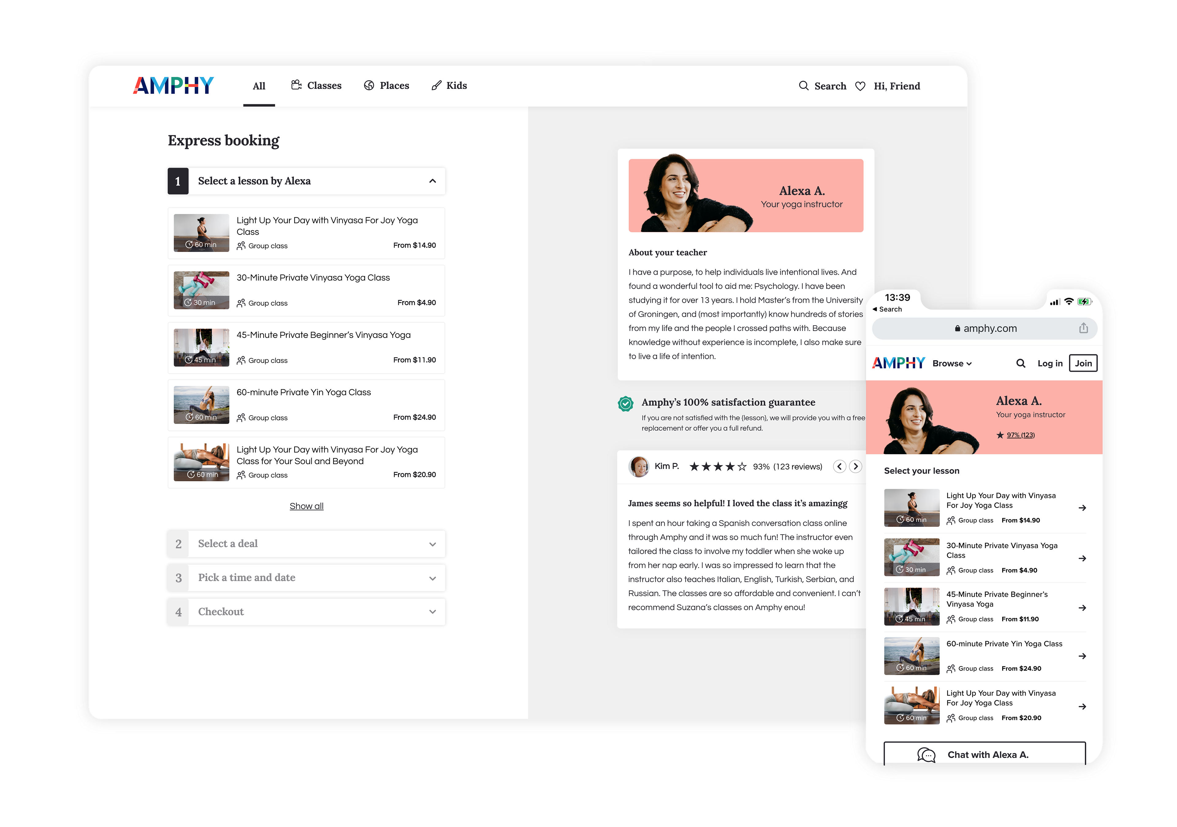
The first step in the process is selecting a class (in case a user comes from the teacher's page directly). We can see the future steps are disabled. For social proofing, we're showing the teacher's reviews at this stage. Having all the information in the same screen fold and splitting the screen into two makes the amount of information easier on the eyes.
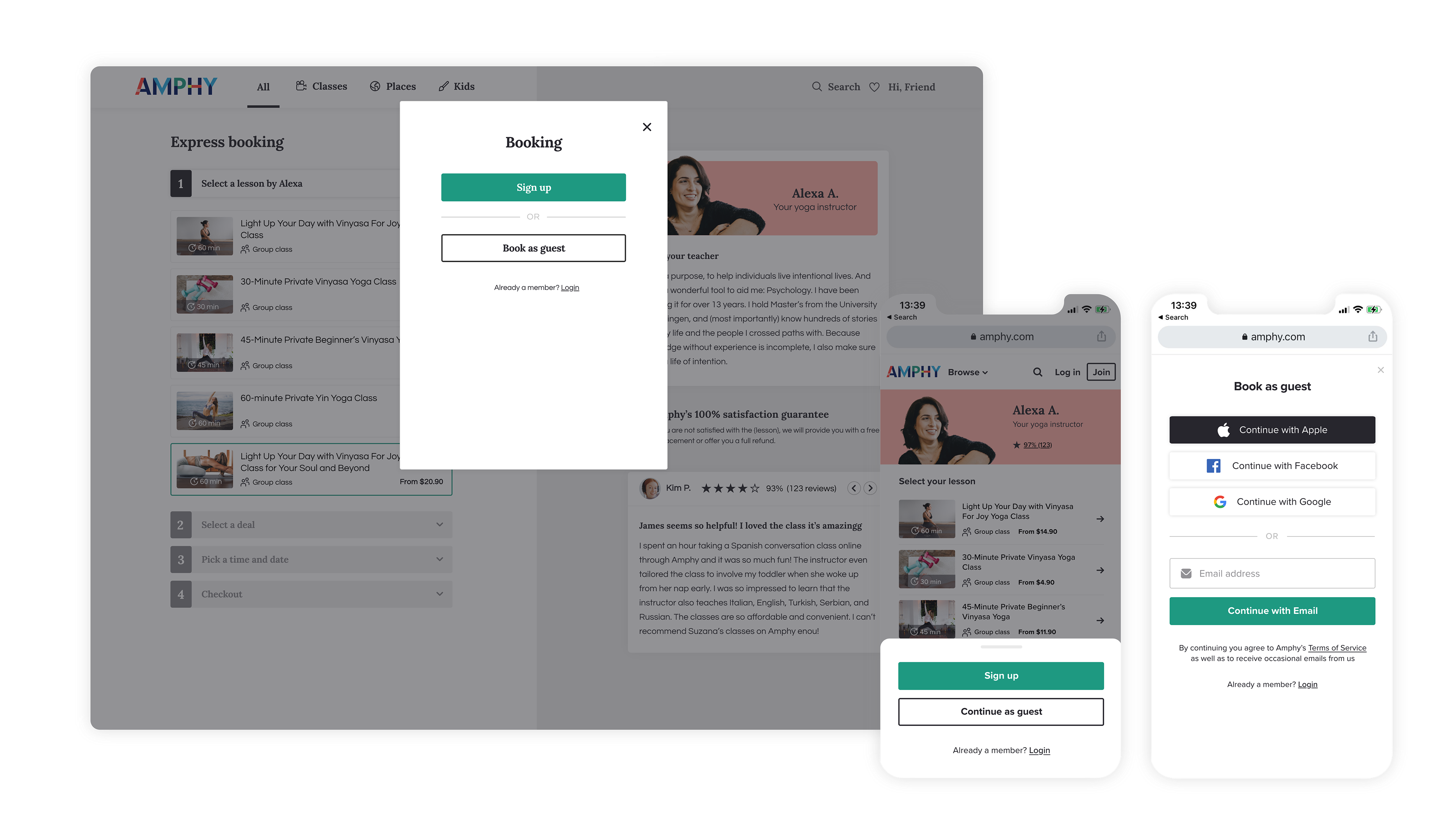
A simple yet effective way of dropping the cart abandonment rate is by eliminating the registration step. Adding the guest checkout option and making it easy to access, while the registration option is a choice and not a must.
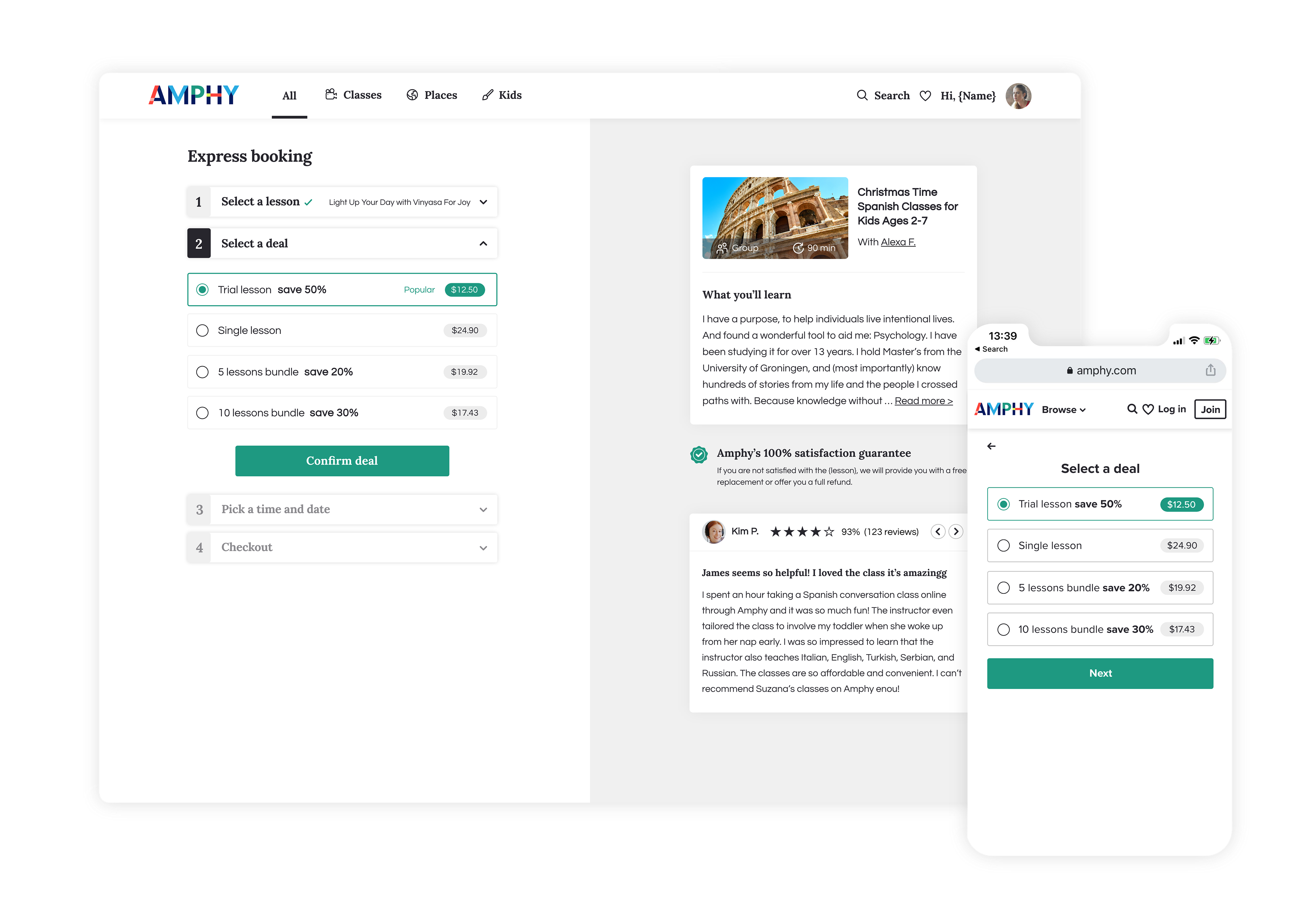
The 'Select a deal' step is very important due to having various options for the student to book. The recommended choice is auto-selected.
The 'Amphy's 100% satisfaction guarantee' badge is visible on the desktop version at all stages of the checkout process in order to boost customer confidence.
The calendar shows the teacher's availability, converted to the user's specific timezone.
In this particular case, the user can choose up to 5 dates for their bundle deal. The calendar is split into two viewing options: the weekly view which suggests having recurring weekly sessions and the monthly view - which offers custom dates and time picking.
On the desktop version, we have the 'Need a different time?' CTA, which offers the user the option to request their own time by chatting with the teacher directly. This option should help reduce the checkout abandonment rates.
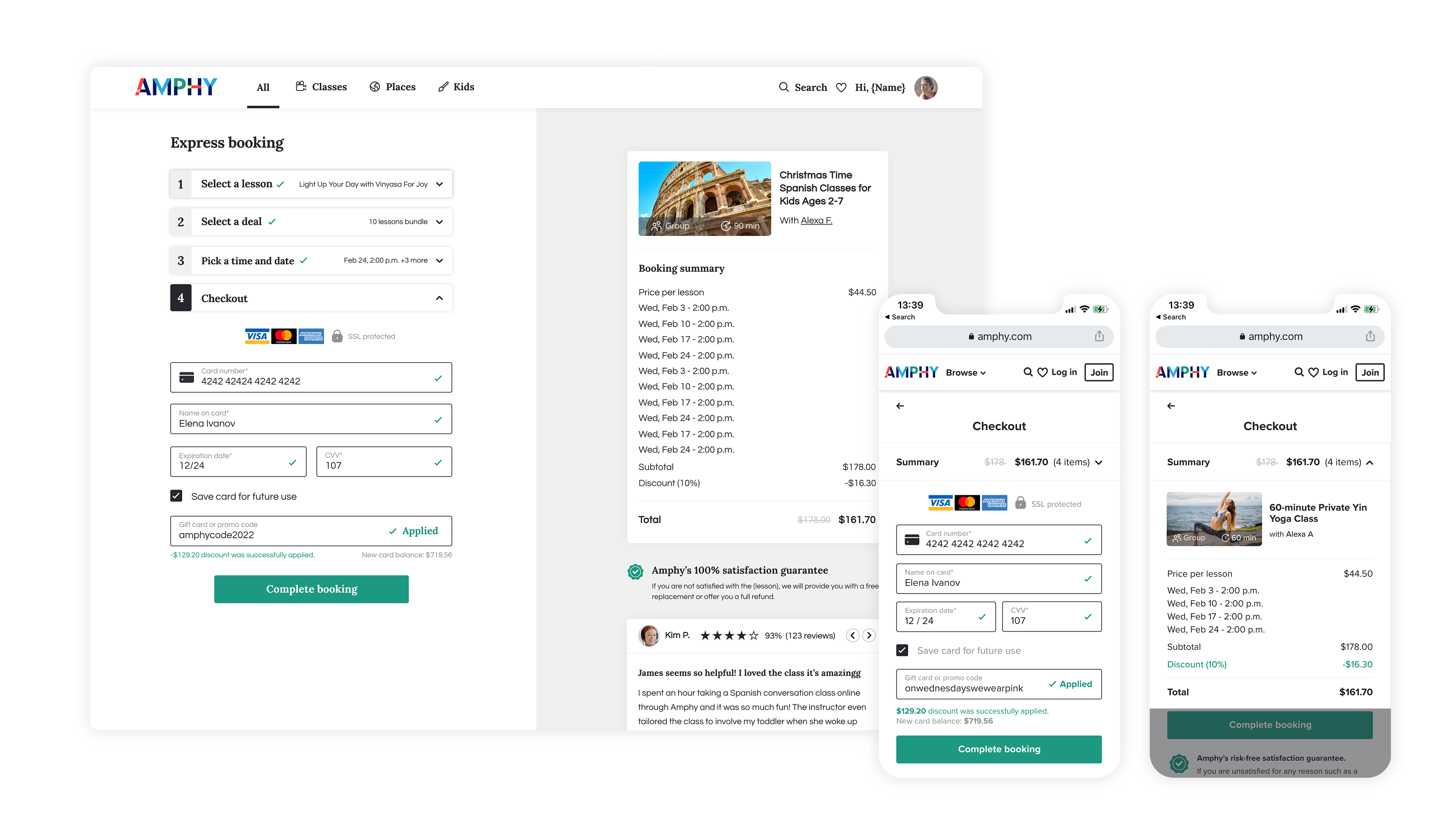
The visual hierarchy in which the order summary is presented is very critical for a smooth checkout and it should give users all the required information. On the desktop version, we have the summary on the right side of the screen, while on the mobile layout the summary is folded up.
Displaying the SSL security-protected message is also crucial when the user is on the payment screen. It helps to create a sense of trust and security during the checkout flow.
For returning or signed-in users, showing previously used cards for transactions can help fasten the checkout process. Users on the go may not always have their credit cards handy. Providing them with the details of previously used cards where they only have to enter CVV will result in faster checkout.
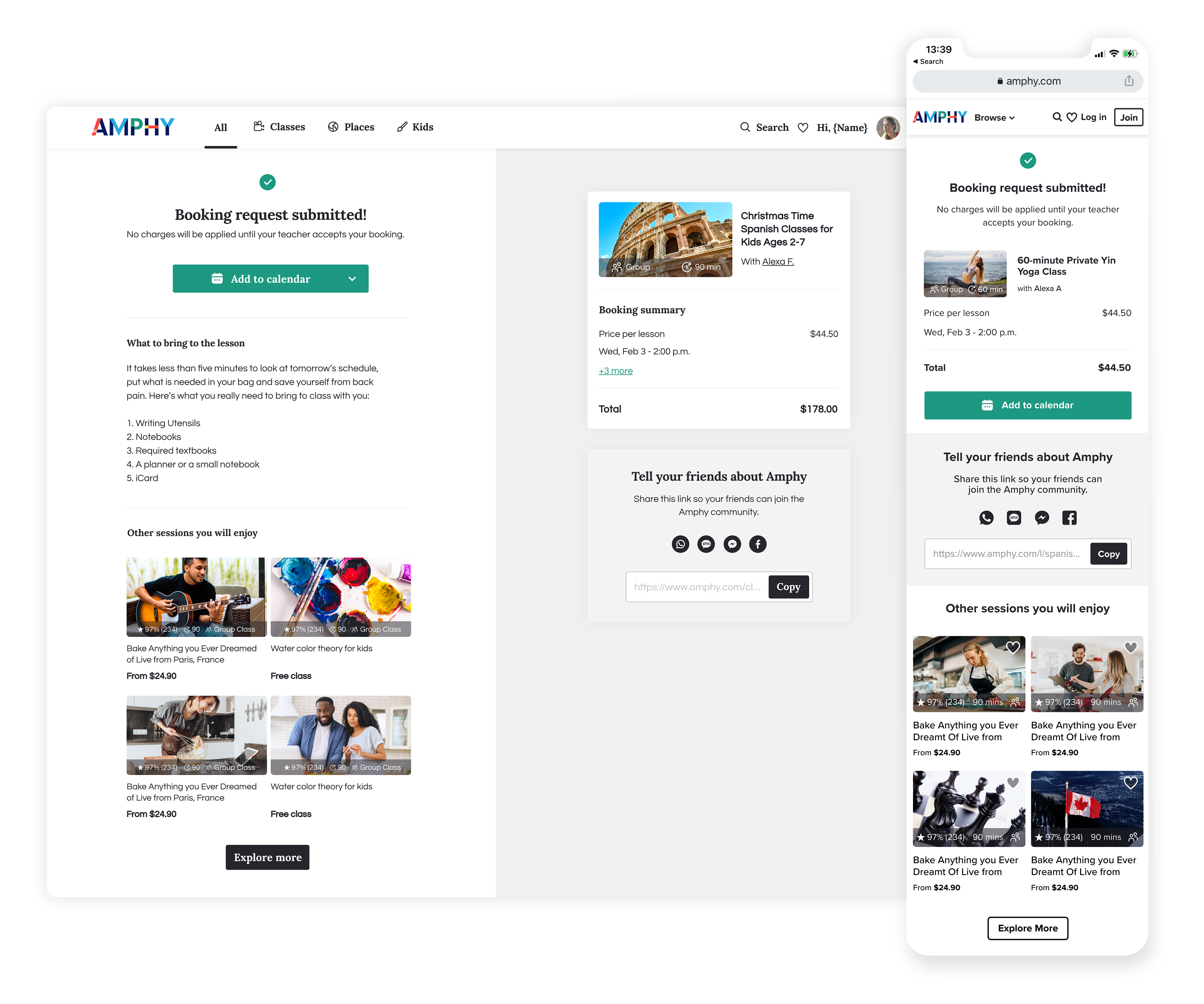
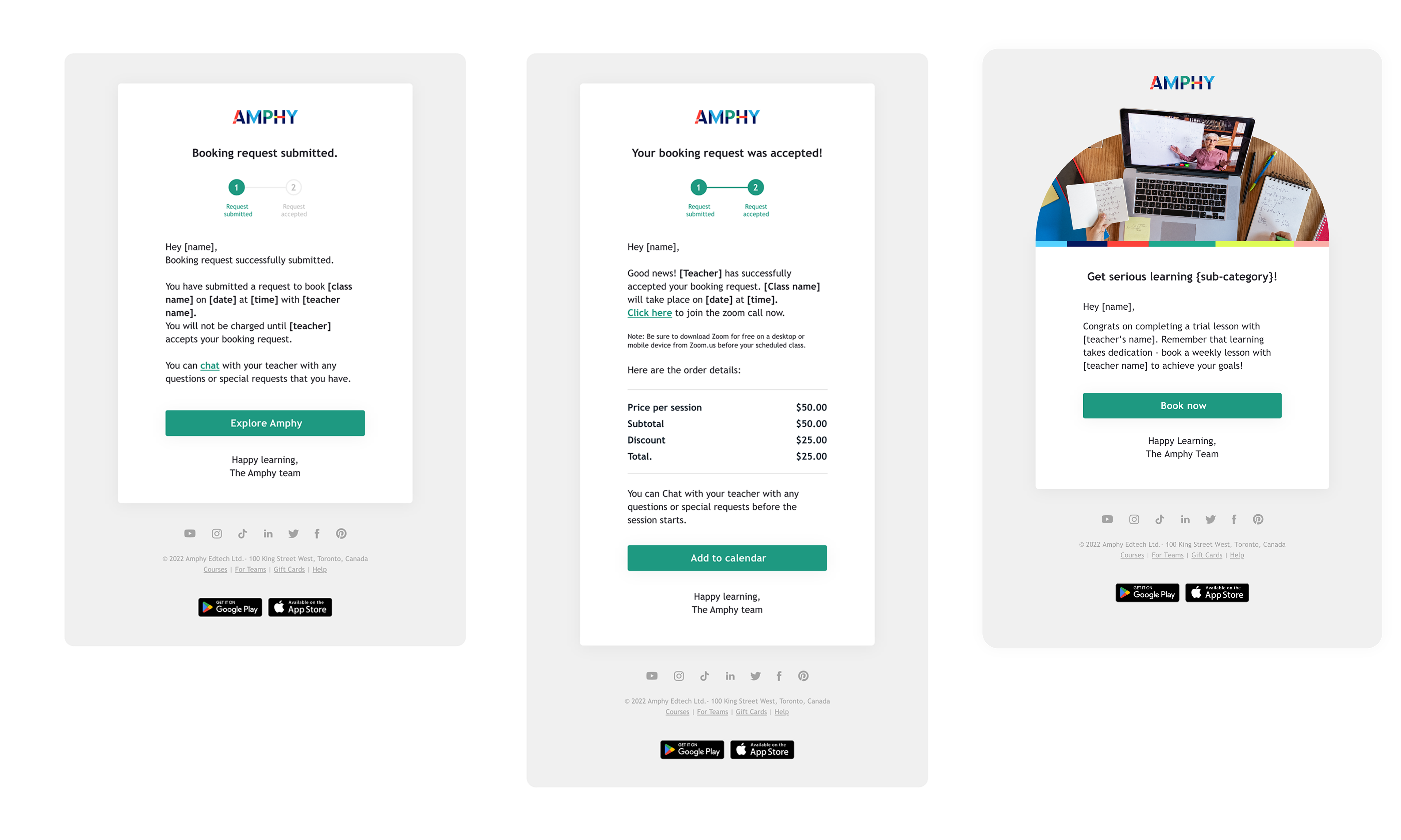
“Purchase Confirmation” is all about letting the user know that the transaction has ended and a confirmation email has been sent out with an order summary. Since we want to keep the users on the site, we suggest other popular classes to explore.
It's very important to use the right terminology in this step since the booking was not yet approved by the teacher - and the credit card was not yet charged. The booking emails are visually showing that the user has completed step 1 out of 2 and that they should expect another email confirming the class date.
One extra helpful feature at this stage is the option to add the class to the user's calendar directly.